My favorite carbonated beverage is changing their branding.
So I’m going to stop drinking it in protest.
Just kidding.
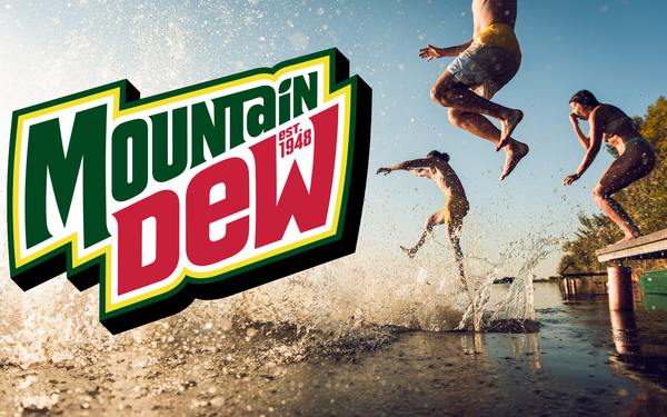
Mountain Dew is changing their labeling to Mountain Dew.
I know, that sounds weird but it’s a visual change, not a verbal change.
Here’s the story from Mediapost titled:
Mountain Dew Unveils New Logo, Visual Identity
After around 15 years, Mountain Dew has found its vowels again.
The brand unveiled its new logo — eschewing the “Mtn Dew” stylization officially introduced in the U.S. market in 2009 –– in favor of the full brand name, while tying the brand’s visual identity back to mountainous peaks portrayed in the background as it approaches its 75th anniversary. Mountain Dew’s new logo also includes small text reading “Est. 1948” over the “W” in its brand name, a nod to the year the trademark was officially established.
I know, it’s shocking. I say that with a ting of sarcasm.
Because honestly, I don’t recall them dropping the vowels out of Mountain in 2009. I didn’t change my buying habits and I won’t now, or when the new logo comes out in 2025.
I was trying to recall when I started drinking the Dew, and I’m guessing it was in the 90’s as an alternative to coffee. Nothing wrong with coffee but the Dew also replaced Pepsi as my go to cold beverage. I recall having a conversation with my kids when they questioned my drinking Mountain Dew in the morning and I pointed out to them that the second ingredient on the label was concentrated orange juice. Let’s be honest, besides the taste and the O.J. Mountain Dew had more caffeine than Pepsi or Coke and that was the main reason I drank it. Also a little over 20 years ago I switched to the diet versions of soft drinks.
What I just shared was my own story and reasons for drinking Mountain Dew.
It has nothing to do with the name, or the logo. Yet someone in their advertising agency was paid big bucks to revamp their visual image.
I’m not against updates. One of my favorite advertising partners on WOWO radio has done an internal name change this year and we’ve updated his ads and also the visual elements. There was nothing wrong with the previous name, Moore and Associates, but it really didn’t identify his brand. Unless you knew from the advertisements that have aired on WOWO for over 29 years who Chris Moore is and what he does, Moore and Associates could be a law firm, or a plumber or nearly anything.
His new name is much more clear and a much stronger branding statement. Moore Wealth Management. Chris and his team have grown over the past 3 decades and the new name is accurate as it reflects what they do now and what they’ve been doing for years.

With all do respect to my friends who specialize in graphic design and understand the subconscious influences of color and typography including font selection, those are secondary to having a good product and service that people will talk about positively. As a side note, I like Comic Sans. Time to crack open a Diet Mtn Dew.

